Typography Exploration Projects
SURFER Editorial Redesign
Featured in SCAD GRDS Showcase + Exhibition — Savannah College of Art & Design
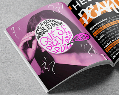
Overview
As part of my coursework at Savannah College of Art and Design, I was challenged to reimagine an issue of Surfer magazine by introducing contemporary editorial content while preserving the publication’s established identity. The project focused on evolving the reading experience through updated layout systems, original editorial storytelling, and visual content that felt relevant to current culture while remaining true to the spirit of the brand.
Design Approach
My approach centered on respecting Surfer’s existing visual language while introducing a more modern editorial system. I developed new grid structures, refined typographic hierarchy, and created original hand-drawn illustrations to support featured stories and current-event content. The goal was to create a refreshed reading experience that felt authentic to Surfer’s adventurous, culture-driven identity while bringing new energy to the publication through contemporary editorial design.


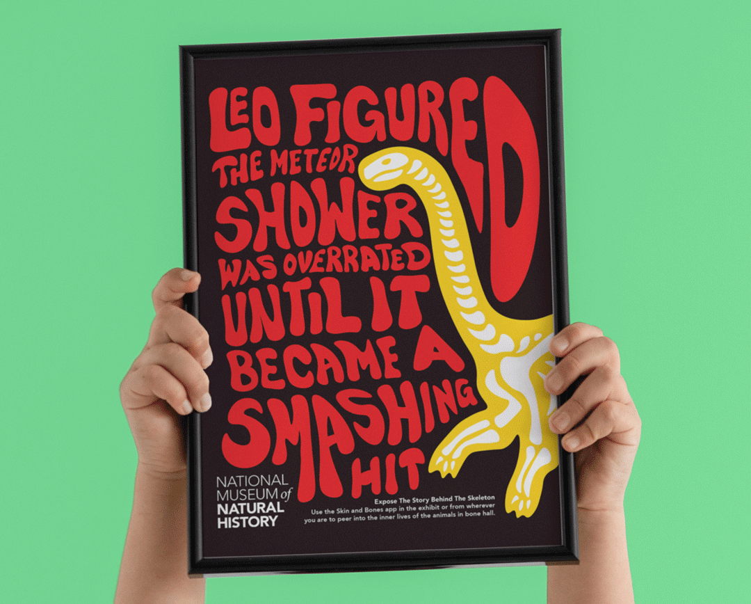
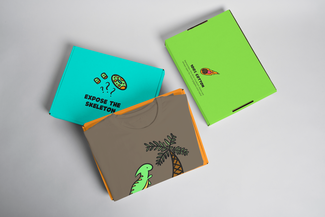
Expose the Skeleton Campaign
Best In Show Ad Campaign Winner — Savannah College of Art & Design
Overview
As part of my coursework at Savannah College of Art and Design, I developed Expose the Skeleton, an integrated campaign concept created for the Smithsonian Institution Bone Hall. Designed to engage younger audiences, the campaign reimagined the museum experience by turning educational content into an interactive adventure. Through environmental graphics, storytelling, and mobile integration, the concept encouraged children and families to explore the exhibit in a way that felt playful, immersive, and discovery-driven.
Design Approach
The creative direction was inspired by the humor and visual storytelling of the campaign Dumb Ways to Die, using playful narratives and bold character-driven visuals to make science and history feel approachable for children. I developed a system of illustrated posters, vibrant typography, and interactive storytelling moments that worked alongside the Skin and Bones mobile app. By scanning campaign visuals throughout the space, visitors could unlock animated content that transformed traditional museum learning into a more engaging, game-like experience.


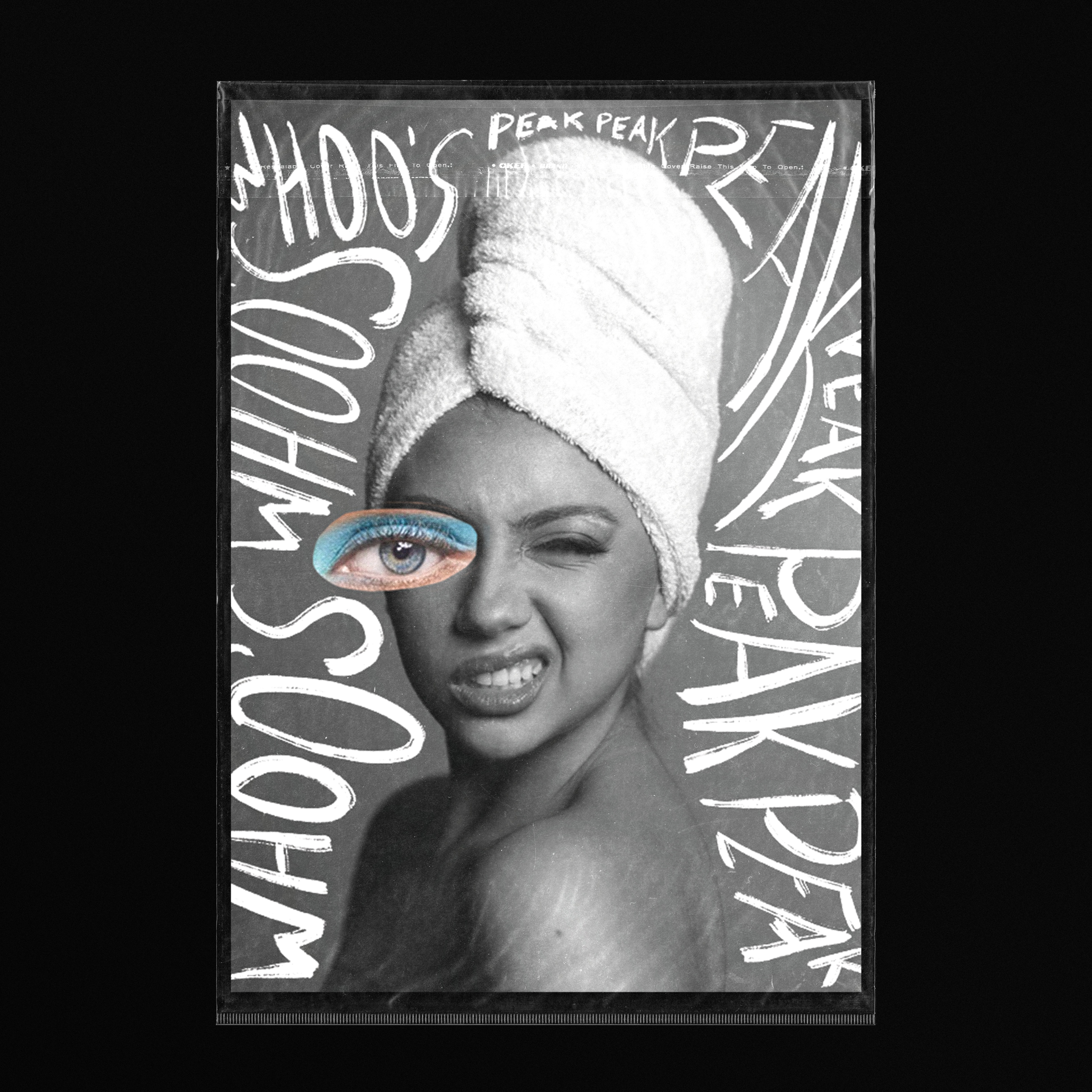
Whoo’s Peak Promotional Posters
Overview
I collaborated with an independent content creator to develop a limited-edition poster series designed to promote her channel while creating something fans could take home, collect, and have signed at live appearances. The goal was to move beyond traditional promotional materials and create pieces that felt personal, memorable, and reflective of her personality, blending content marketing with collectible design.
Design Approach
The creative direction centered around capturing the client’s personality in a way that felt raw, playful, and visually unexpected. Using imagery from her photoshoot as the foundation, I hand-illustrated expressive doodles, typography, and layered graphic elements directly over the photography to create a more personal, editorial-style aesthetic. The combination of monochromatic imagery with selective color accents helped create a bold visual system that felt both collectible and authentic to her brand.